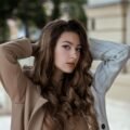
But honestly, it’s not always about the face or the pose. After years of trial and error (and some truly tragic tagged photos that I’ve hidden from my profile forever), I’ve realized that event dressing is an actual science. There are specific fabrics, cuts, and colors that the camera just loves, and then there are others that will make you look like a blurry blob no matter how much you spent on your hair.
I remember this one time, about two years ago, I went to this fancy gala event. I wore this gorgeous, super expensive silk dress in a very pale beige color. In person? I looked expensive. I felt like a goddess. But then the professional photos came back. Girl… I looked totally washed out. Like, ghost-level pale. Because the flash hit the fabric and the color was too close to my skin tone, I basically disappeared. I learned a very expensive lesson that night. Never again!
So, because I want us both to look like absolute icons at every party this year, I’ve put together this guide. We’re talking about the event outfits that actually photograph well and why some of our favorites are secretly sabotaging our photos. Let’s dive in!
1. The “Matte” Rule: Avoid the Shiny Trap
This is probably the biggest secret in the industry. We all love a bit of sparkle, right? We see a sequin dress or a high-shine satin slip and we think “Yes, this is the one.” But here is the thing: professional cameras with heavy flashes absolutely hate shiny fabrics. The light bounces off the material and creates these weird white hot-spots in the photo. It can make you look much wider than you actually are because the camera can’t find your edges.
Instead, the most stylish women always opt for matte fabrics. Think heavy crepes, high-quality wool blends, or matte silk. These fabrics absorb the light rather than reflecting it. This creates a soft, blurred effect on your body that looks incredibly flattering. It’s basically like wearing a real-life filter.
I started doing this for my more “official” events. I swapped my shiny satins for a deep, matte velvet or a heavy crepe jumpsuit. The difference in the photos was insane. I actually looked structured and slim instead of just… shiny. Trust me on this one, if there is going to be a lot of flash photography, leave the sequins at home or keep them to tiny accessories.
Your Matte Checklist:
- Crepe is King: It has a slight texture that looks amazing in high-res photos.
- Watch the Satin: If you must wear it, choose a darker color like navy or emerald so the “shine” isn’t as distracting.
- Beadwork over Sequins: Small matte beads add texture without the “flashback” of flat sequins.
2. Mid-Tones and “Jewel” Colors are Your Best Friends
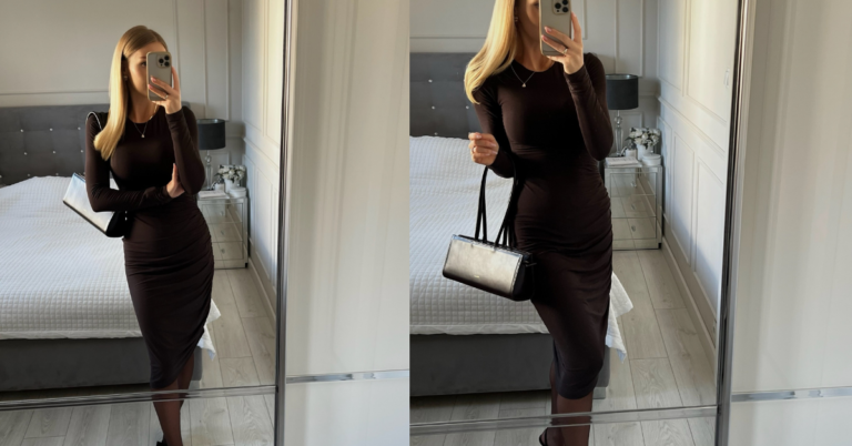
Okay, let’s talk about color. I mentioned my “ghost” incident earlier, and it’s a classic mistake. If you wear colors that are too light (like whites, creams, or very pale pastels), the camera often over-exposes them. You lose all the detail in the dress and you just look like a white triangle. On the other hand, if you wear solid black, the camera can’t see the “shadows,” so you lose your waistline and your shape altogether.
The sweet spot for photography is Jewel Tones and Mid-Tones. We’re talking deep emerald green, rich sapphire blue, burnt orange, or a beautiful terracotta. These colors have enough depth for the camera to see the shadows (which gives you shape) but are bright enough to make your skin look vibrant.
Last summer, I wore this deep rust-colored midi dress to my cousin’s graduation. It wasn’t my usual “vibe,” but man, those photos are still my favorites. The color made my brown skin look so warm and glowing, and even in the harsh midday sun, the dress looked expensive and detailed. Whenever you’re in doubt, go for a color that has some “soul” to it. Stay away from the boring greys and the super-pales.
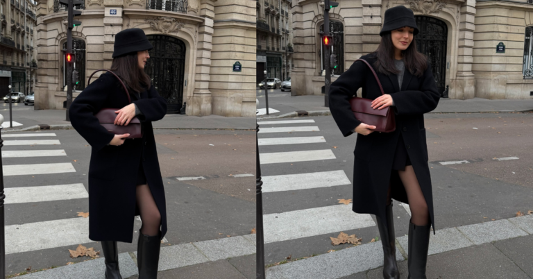
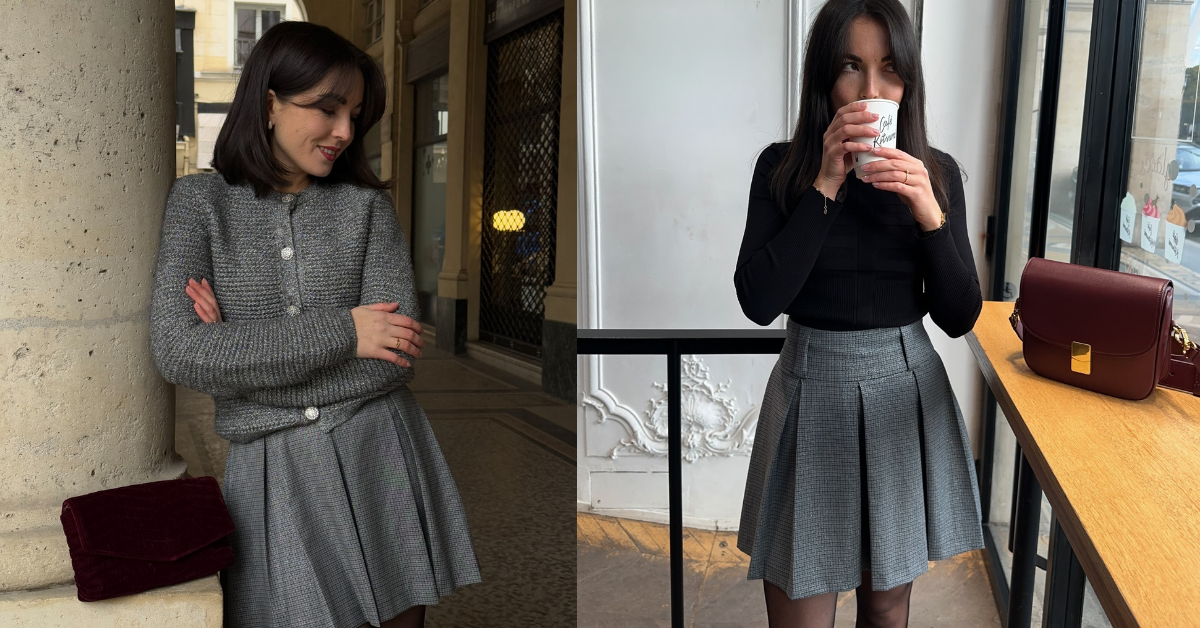
3. Structural Integrity: The Power of a Good Seam
Have you ever seen a photo of yourself where you look kind of… slouchy? Even though you were standing up straight? That usually happens because your outfit lacks structure. Soft, flimsy fabrics like thin jersey or cheap polyester tend to cling to all the wrong places when you move. The camera captures every little fold and wrinkle, which can make the outfit look messy.
Stylish women know that for an event, you want something with “bones.” This means structured shoulders, defined waistlines, and maybe some boning in the bodice. You want the clothes to hold their own shape, regardless of what your body is doing. It’s like a little suit of armor that makes you look poised in every single frame.
I’ve started investing in blazers and structured dresses with proper lining. Even if I’m just wearing a simple dress, if it has a built-in lining, it smooths everything out. It’s not about hiding your body, it’s about giving the camera a clean line to follow. You want people to see the silhouette, not the wrinkles in your fabric.
4. The “Small Print” Danger Zone
This is a bit of a technical one, but it’s so important if you’re going to be on video or in high-quality digital photos. Have you ever seen a photo of someone wearing a very tiny checkered shirt or a tight striped pattern, and the photo looks like it’s vibrating? That’s called the Moiré effect.
Digital sensors struggle to process tiny, repetitive patterns. It creates this weird, dizzying wavy line effect in the photo that is basically impossible to edit out. If you want to wear a pattern, go big! Large florals, abstract shapes, or wide stripes photograph beautifully because the camera can easily “understand” what it’s looking at.
I remember my friend wore this teeny-tiny houndstooth blazer to a brunch event we did for work. In person, she looked amazing. In the group photo? Her jacket looked like it was from a glitchy video game. She was so bummed. Now I always tell people: if the pattern is smaller than a coin, maybe skip it for the camera.
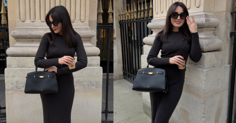
5. Necklines and “The Floating Head” Problem
How you frame your face is everything. Sometimes, we wear these super high-neck tops or big chunky scarves because they feel cozy or “fashion.” But in photos, especially close-ups, a high neck can sometimes make it look like your head is just floating on top of a pile of fabric. It “shortens” your neck and can make you look more closed-off.
The most photogenic necklines are usually the ones that show a bit of decolletage. V-necks, square necks, or sweetheart necklines are classic for a reason. They draw the eye up toward your face and “lengthen” your torso. It makes you look taller and more elegant in photos.
Whenever I wear a higher neckline now, I make sure to pull my hair back into a sleek bun or a high ponytail. This keeps the line of the neck clear so the camera can see your actual structure. If you’re wearing your hair down and a high neck… girl, you’re just gonna look like a head in a bush. Let’s avoid that, okay?
6. Don’t Forget the “Movement” Test
Finally, and this is my favorite tip: you have to do the Movement Test in front of a mirror before you leave the house. Most of the photos taken at events are not perfectly posed. People are laughing, walking, or reaching for a drink. You want an outfit that looks good in motion.
If your dress only looks good when you are sucking in your breath and standing at a 45-degree angle… it’s not a good event outfit. You’re going to spend the whole night stressed out and it will show on your face. Truly stylish women choose clothes that flow. A skirt that swishes when you walk or a sleeve that has some drama. These “candid” moments are usually the best photos anyway, so give the camera something to work with!
I once wore this incredibly tight pencil skirt to a cocktail party. I could barely sit down. In the photos where I was standing still? Great. But in all the photos where I was actually having fun? I looked stiff and uncomfortable. It totally ruined the vibe of the memories. Now, I always make sure I can dance, sit, and hug people in my outfit. If you feel good, you will look good. It’s that simple.
Just a little note - some of the links on here may be affiliate links, which means I might earn a small commission if you decide to shop through them (at no extra cost to you!). I only post content which I'm truly enthusiastic about and would suggest to others.
And as you know, I seriously love seeing your takes on the looks and ideas on here - that means the world to me! If you recreate something, please share it here in the comments or feel free to send me a pic. I'm always excited to meet y'all! ✨🤍
Xoxo Sophie