
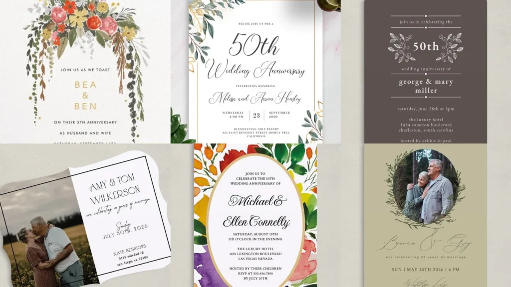

Looking for anniversary party invitations that feel a little more personal? Wedding photos, little heart drawings and colorful flowers give you plenty to choose from.
I especially love the designs that put an old photo next to a newer one.
You can keep it simple or go all out with color. These ideas include invitation designs plus a few related images worth borrowing details from.
Pick your favorite colors first, then decide whether you want your photo to be part of the design.
Anniversary invitation ideas worth saving
we still do
We’re starting off strong with this sweet then-and-now photo invitation. I love the oversized script in “we still do” above the two overlapping pictures.
Choose a wedding photo and a recent portrait for your own version. Keep the thin gold-colored border if you want that same simple finish.
olive green and leafy branches
How pretty is this olive-green design? The oval portrait has leafy branches curling around it, with the couple’s names in loose script underneath.
Read also: 20 Ideas for Centerpieces Without Flowers, With a Few Looks to Adapt
If you don’t want a white background, this is a lovely alternative. I’d keep the smaller party details centered just like these.
gold script on black
I am obsessed with the gold-colored lettering against this black background. The tilted photos and their uneven white borders make the layout look a little like a scrapbook.
Try the same mix with an older wedding picture on one side and a recent photo on the other. The little flourish at the bottom is worth keeping too.
silver-gray sparkle
If you are looking for something without a photo, this one is for you. A large “25th” and sweeping black script fill the top of the silver-gray invitation.
The starburst pattern adds plenty of sparkle on its own. You could pair your version with a black envelope like the one shown behind it.
flowers cascading from the top
This floral invitation may just be one of my favorites here. I love the pink, orange and yellow flowers at the top, especially with those long trails of greenery.
Keep your names and event details in the open space below. There’s no need to add another illustration at the bottom.
red and little string lights

Want to make the anniversary number a big part of the design? This red invitation does exactly that with a huge white “40” behind the gold-colored script.
The little illustrated lights across the top are so cute. Try this combination for an anniversary dinner invitation if you love a bold background.
vintage photo and anniversary badge
The wedding photo takes up almost half of this invitation, which I love. A green scalloped badge holds the “50” on the other side, with an orange banner below.
Choose a landscape layout if you want to try this arrangement. The beige patterned background is a pretty alternative to plain white.
wavy edges and little hearts

How cute are these two hearts tied together with a bow? The black line drawing is so simple, but it gives this white invitation such a sweet detail.
Read also: 20 Bachelorette Party Invitations and Cute Designs to Inspire Yours
I also love how the wording curves above the hearts. Keep the wavy outline if you want something a little different from a straight-edged card.
green leaves and a fine border

Don’t want to go overboard with flowers? No problem! This design uses green leaves and gold-colored outlines in opposite corners.
The large anniversary heading sits inside a fine rectangular border. Try the same corner arrangement if you want plenty of white space around your wording.
a heart around your wedding photo

I love this oversized heart around the black-and-white wedding picture. It extends beyond the photo rather than fitting neatly inside it, which is such a pretty touch.
Place your names below in flowing script. I’d leave the remaining details small and simple so the photograph stays the main part of the invitation.
Read also: 20 Engagement Party Invitations and Design Ideas to Inspire Yours
cheers to forty years
How sweet is this little toast illustration? The red drawing shows two glasses meeting beneath a tiny heart, with “Cheers To Forty Years” at the top.
This is a lovely option if you’d rather use an illustration than a photo. Repeat the same red in your heading to follow this design.
little white leaves on taupe
If you’re looking for an understated invitation, go with this dark taupe background and white lettering. The curled leafy branches around “50th” add just enough decoration.
Read also: 20 Green Party Decor Ideas With Pretty Tables and Leafy Backdrops
The thin dividing lines and little dots are my favorite details. Keep them in your version if you like a neatly separated layout.
peach and a leafy fifty
This is another then-and-now photo idea, but it’s a little different from the ones above. I love the peach background and the leafy circle overlapping both pictures.
The “50” sits right in the middle of that circle. Try placing your names directly beneath it in a matching gold-brown shade.
pink and colorful confetti

Planning a surprise party? This image is a wording-ideas graphic rather than a finished invitation, but the bright pink center and colorful confetti border are worth saving.
For your own invitation, you could borrow those colors and add a clear request to keep the celebration a secret. Include the guest arrival time so everyone knows when to be there.
a portrait framed with greenery
I am obsessed with the leafy frame around this portrait. The thin gold-colored geometric lines peek through the greenery, with “Celebrating love” written underneath.
Choose a close-up photo for a similar look. I’d keep the party information below the script rather than adding text over the picture.
half photo and half wording

Don’t want to squeeze your photo into a small frame? This layout gives it a whole side of the invitation.
The other half stays white for the names and celebration details.
I love the wavy outer edge with that straight black border inside it. It’s a fun little combination without adding flowers or extra colors.
navy with a gold-colored rose
The navy and gold-colored pairing is so pretty in this design. A single outlined rose sits on the side of the arch, with “10 years” near the top.
If you want a floral detail without a whole bouquet, try this one. Keep the wording inside the arch to follow the same layout.
retro stripes and starbursts
Calling all retro-color fans! The mustard, orange and brown curves in this design are so fun, especially with the little starbursts between them.
This example is a wedding invitation, not an anniversary invitation. To adapt the idea, you could keep the palette and outlined lettering but replace the wedding wording with your anniversary celebration details.
burgundy with an ivory bow

This one shows the invitation’s outer presentation rather than the wording inside. I love the ivory bow against the deep burgundy, with pale scalloped trim following the flap.
If you want to borrow this look, try a burgundy invitation wrap with a light-colored bow. A simple card inside would be a pretty pairing.
Read also: 20 Lunar New Year Party Ideas With Lanterns, Flowers and Festive Treats
colorful flowers around an oval

Last but definitely not least, we have this gorgeous floral invitation. I love the purple and orange flowers with all those green leaves!
The party details sit inside a large white oval with a gold-colored outline. Keep that clear center if you want a colorful border without putting words over the flowers.